Websson
Design System, iGaming
A unified design system built to support multiple brands, technologies, and teams for Betsson Group's portfolio of online products
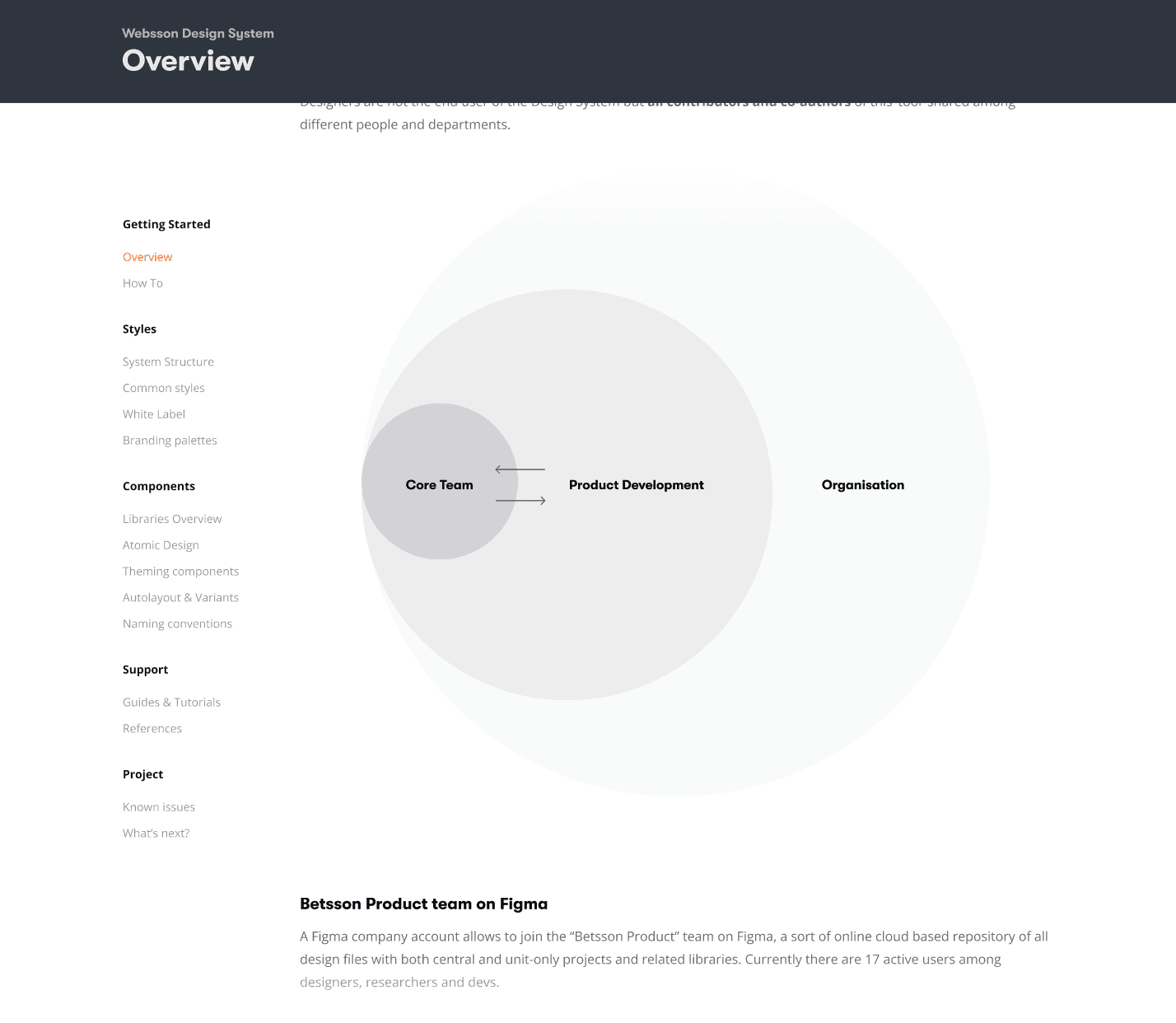
Project overview
Websson is a scalable design system developed during my one-year collaboration with the central design team at Betsson Group. Betsson Group operates more than 20 product websites across different brands, tech stacks, and geographies. Each platform had evolved independently over time, resulting in overlapping but disconnected UI patterns.
The project was led entirely from within the company’s central product team, with close collaboration from developers and product owners, aiming to gradually align visual systems, tokens, and components without disrupting active production environments.
From styles fragmentation to semantic variables
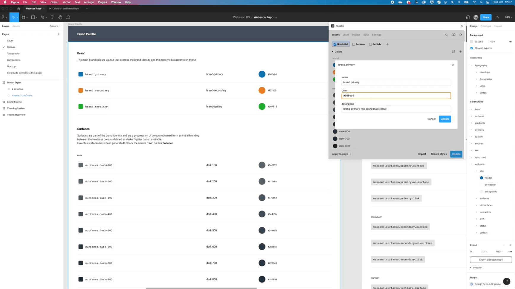
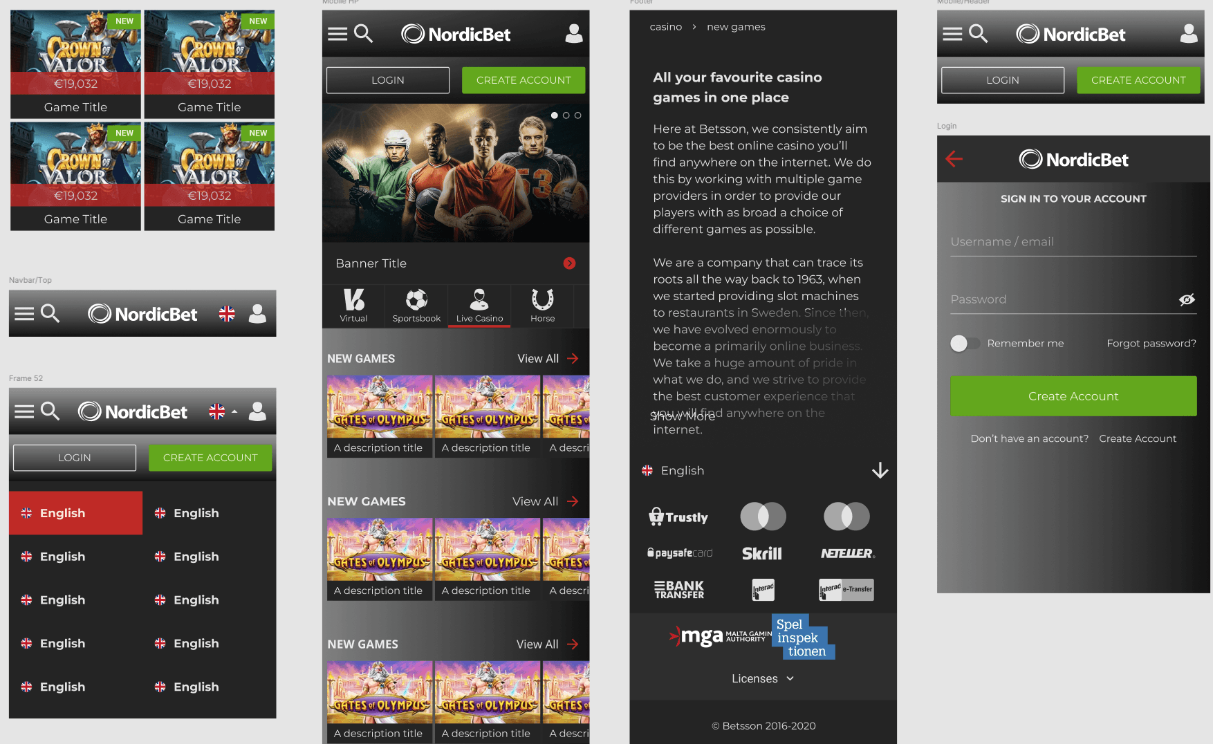
Websson adopted a semantic design token approach, allowing each brand to remain distinct while aligning under a shared logic of spacing, typography, and UI structure.
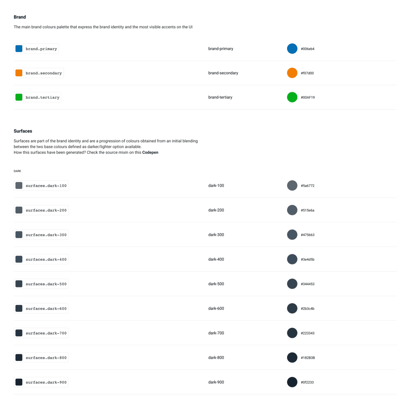
Core elements like color variables, component behaviors, and typography styles were centralized in Figma and exported to development via shared tokens.
Through variable naming and token mapping, legacy styles were gradually translated into theme packages, making it possible to update or extend UI elements centrally while still supporting unique brand theming. This hybrid approach created a balance between global governance and brand-level flexibility.
Surfaces logic & dynamic theming
A key concept in Websson was the idea of “Surfaces”, that are foundational UI layers that adapt dynamically to any brand’s palette. Each surface variant is generated using a logic-based color engine, mapping core roles (backgrounds, highlights, overlays) from a base color scheme.
This approach allowed rapid prototyping and rollout of consistent color environments, with dark/light variants, contrast accessibility, and theming layers auto-generated from minimal inputs.
Design + development in sync
To ensure adoption across departments, a comprehensive documentation site was developed, detailing every part of the system and theming guidelines. This resource was tailored for designers, developers, product managers, and brand owners alike, turning the system into a shared reference point for future product development.
Internal documentation and rollout
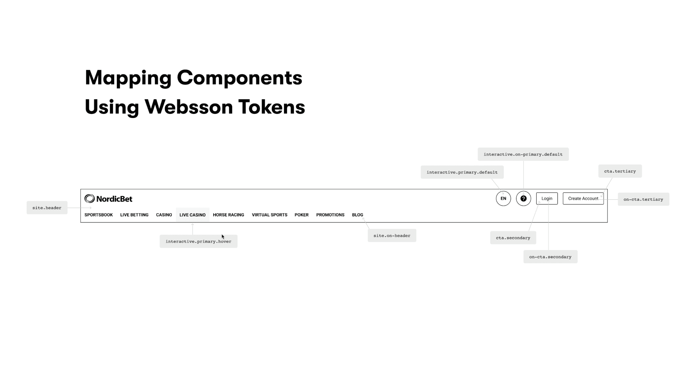
Each semantic variable was tied to a design token, which then pointed to a specific color, size, or value in the final theme. This nested structure made it possible to cascade design decisions across the system, allowing changes at the token level to propagate predictably throughout the UI.
See it in action!
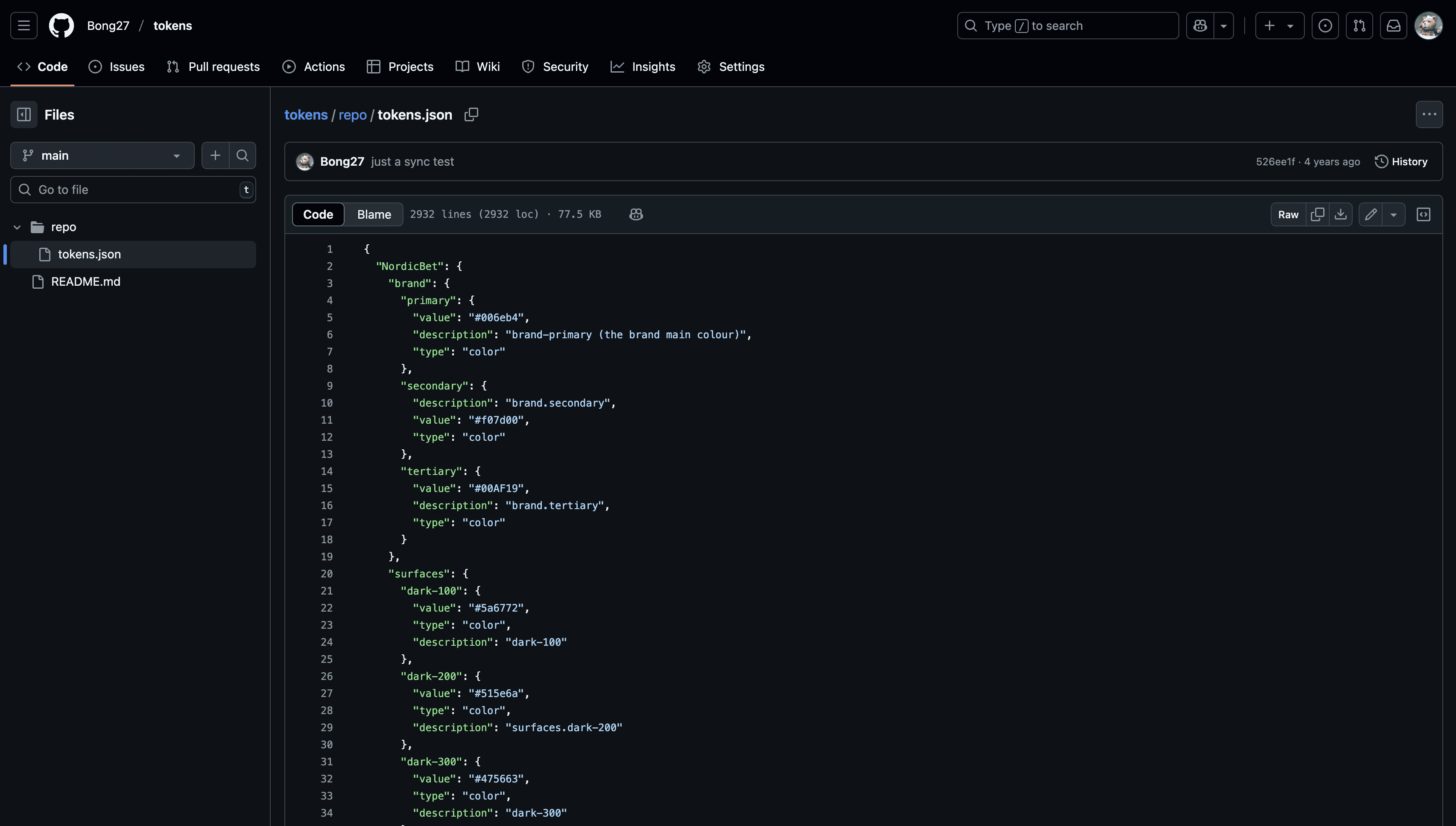
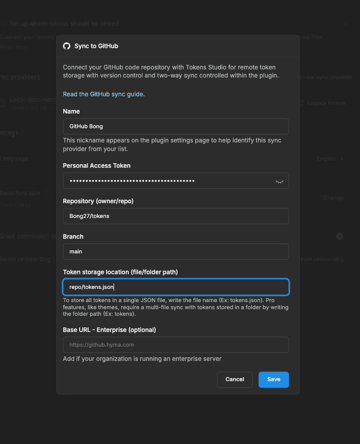
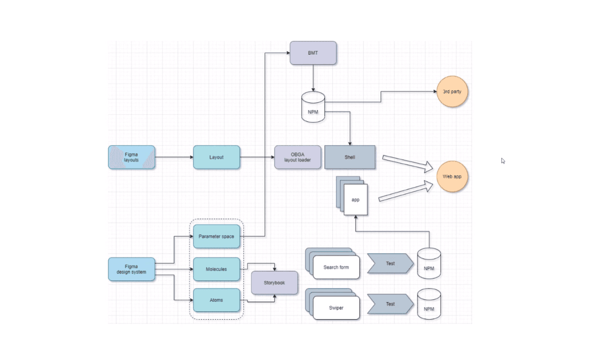
One of the most impactful innovations was our workflow linking Figma to Storybook via the same design token source. Designers edited theme tokens directly in Figma, exported them as JSON, and pushed updates to GitHub.
These updates were automatically consumed by the front-end system, making real-time style changes visible in developer libraries without manual handoff. This Figma > GitHub > Storybook pipeline gave designers ownership over UI theming while closing the feedback loop between design and code.
Key takeaways
To keep scalability in mind, I built out a core design system of over 40+ components:
Built to unify over 20 legacy brand sites with varying tech stacks
Semantic tokens created theme consistency without sacrificing brand individuality
Surfaces and theme packages automated scalable color systems
Figma and GitHub were kept in sync via JSON files, creating a two-way design-dev bridge
Documentation supported cross-team usage and smooth internal onboarding
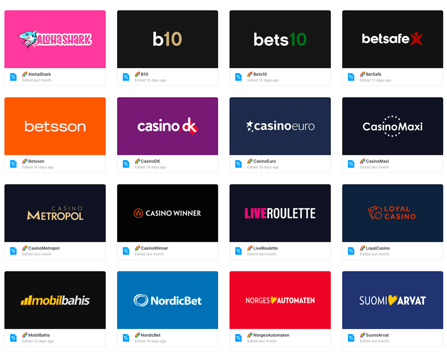
Product gallery

next work case