MAY 12, 2025
2,223 words
5 m
📊 Power BI,
a data design challenge
Turning enterprise dashboards into clear visual narratives
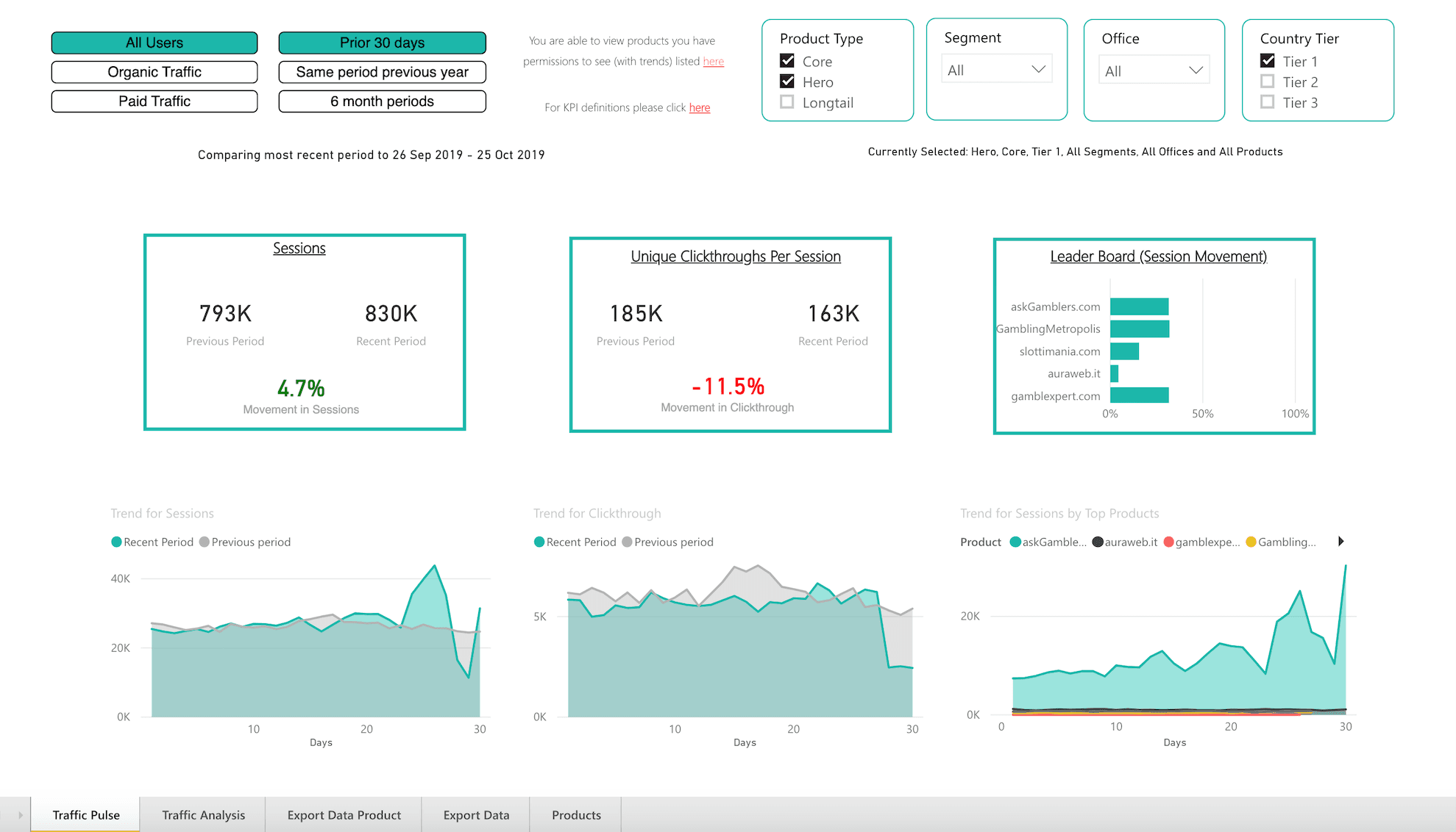
When working with R&D department at Catena Media, one of the projects was the redesign of the company’s main Power BI dashboards, an essential internal tool used daily to monitor performance across markets, teams and campaigns.
For most designers, Power BI isn’t exactly a dream canvas. It comes with strong limitations in layout control, interactivity, and styling. And that's where the constraint impact with design: how do you make data readable, structured, and beautiful within such a limited 'tech-only' environment?
The initial state of art
Before the redesign, the main Power BI dashboard was dense, unstructured, and difficult to parse at a glance. Metrics were stacked with no visual hierarchy, and the lack of clear grouping made it hard to understand what data mattered most. The result was high visual fatigue and an overall 'flat' dashboard that only displayed numbers, but not insights.
Designing inside the tech grid
Rather than fighting Power BI’s framework, I worked with it. The first step was rebuilding the main page layout, using a simplified structure based on the F-shaped reading pattern, a layout proven to match how people scan complex pages.
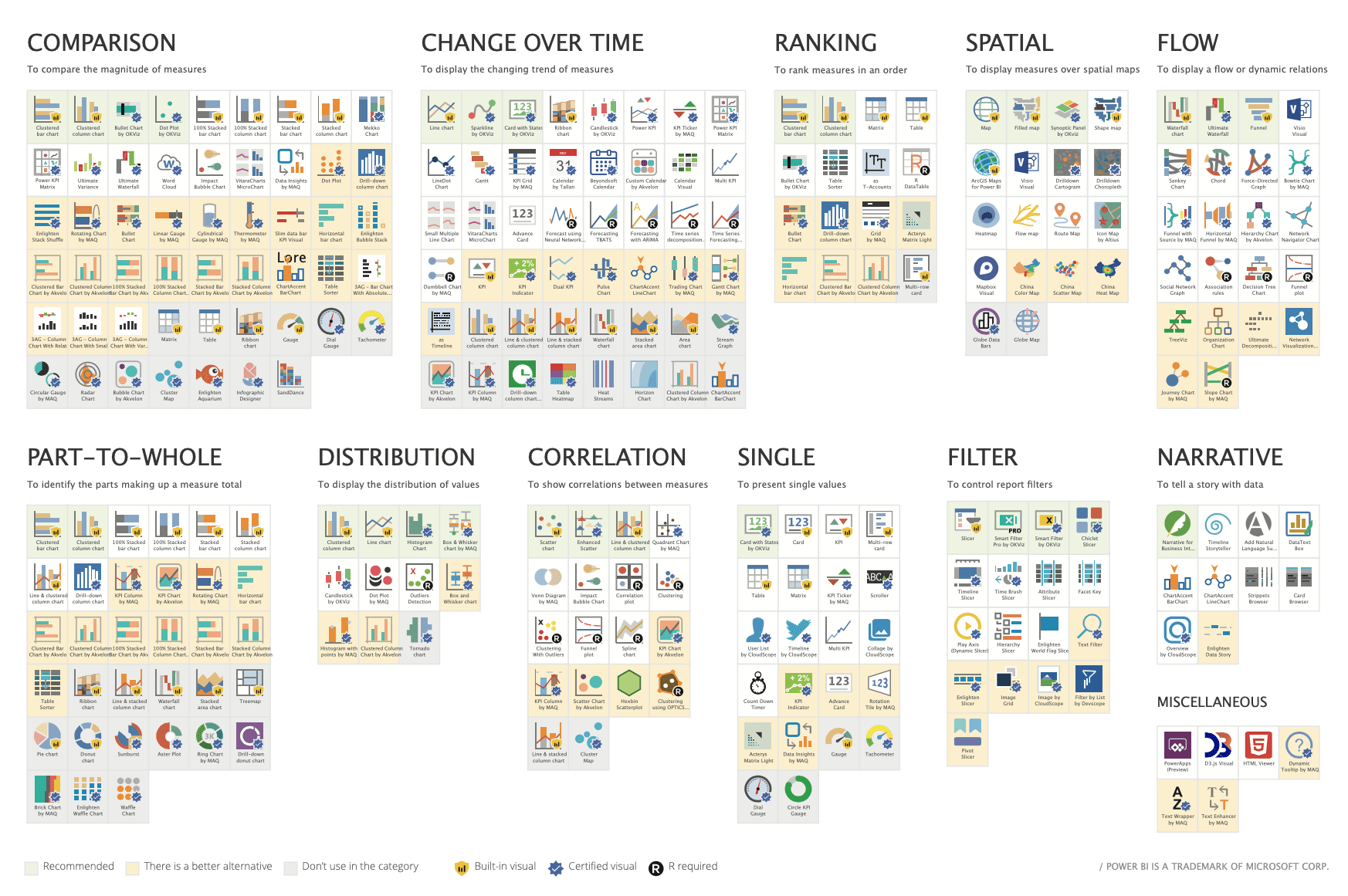
To support the redesign with informed decisions, I leveraged the Power BI Visuals Reference by SQLBI, a comprehensive resource that catalogs native chart types and their ideal use cases. This helped me quickly evaluate which visualizations best matched the intent of each metric, ensuring clarity over complexity.
Meaningful use of colors and refreshed data
Metrics followed a functional color system where green signaled growth, red indicated negative trends, and neutrals maintained visual balance across sections. Additionally, subtle loading animations were introduced to improve perceived responsiveness, offering users instant feedback during data refreshes and the feeling of real-time happening.
Redesigning within the constraints of Power BI was a valuable exercise in clarity, structure, and get to know deeply how tightly data and design are tied to each other. The result was a dashboard that not only looked more refined but supported faster, more confident decisions, proving that even within rigid tools, design plays its crucial role.